aclaptc
i originally had intended to make a post about toxic ingredients in everyday products, but i decided the last thing i wanted to do with this blog was be preachy. instead, i made a new picture in microsoft paint and i've decided to share it.
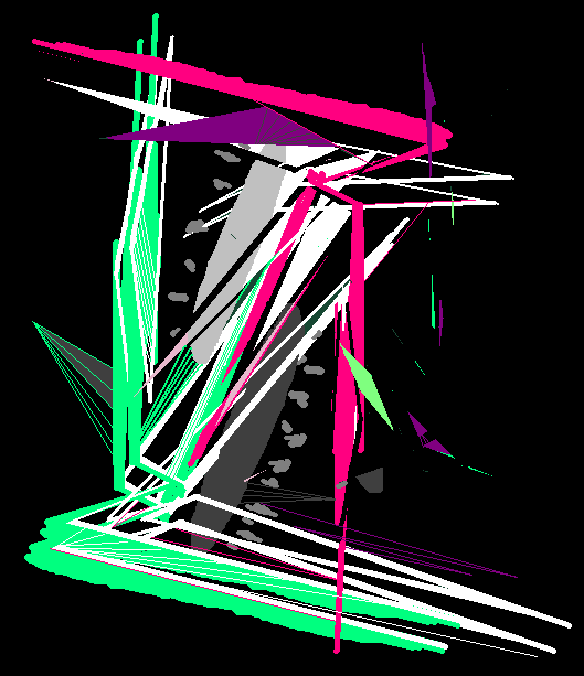
i called this painting aclaptc, which doesn't mean anything. for close to a year i have been extremely inspired by vorticism. i really like working with the plentiful lines and sharp shapes. i'm also often fixated on colors, and have more recently been trying to reign myself in when it comes to the amount of different colors i use in a single picture. with this one, i went with the old reliable: watermelon color scheme.
green and pink are invulnerable as a color pairing. there's so many colors that play off of this pairing, like royal purple and light blue. while i believe the pairing never fails, i've been trying not to use it too frequently. whenever i tell myself to start with two colors, i habitually gravitate toward this duo. in trying to use it less, i've found a lot of pleasure in working with orange and purple as a pairing.
overall, i feel that limiting my palette has been beneficial to my art. it helps pictures stay cohesive and also helps me develop ideas better. next post should feature a new picture because i've been making a lot recently and have a handful to share.
until then,
riptidejim